
March 2015 - December 2015
Building Trust to Book a Home You Haven't Seen
UX Designer
Introduction
Spotahome asked users to trust a home they hadn’t seen and book it without visiting. The redesign had to build that trust into the experience itself, mainly through two differentiators: runners (on-site verifiers who checked every property in person) and detailed neighborhood insights, so a booking decision could be made with real confidence instead of listing photos alone.
I owned the UX redesign end to end: research, design system, and the interface work that carried both across the product.
Framing
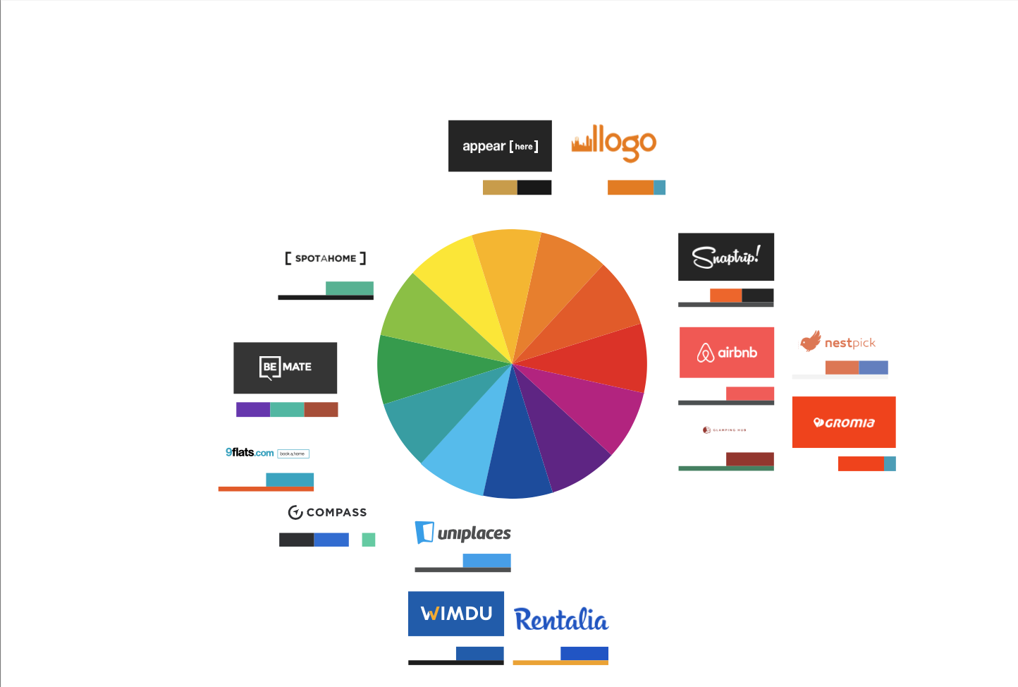
The market’s interaction patterns were already fixed. Airbnb, appearHere, and the rest of the category had converged on the same booking flow, the same visual language, the same way of presenting a listing. Competing on interaction pattern would have meant competing on Airbnb’s terms.
We discarded trying to out-interact the category and invested in design instead: a solid, scalable, recognizable design system built to carry Spotahome’s identity across markets, languages, and new lines of business, not just the current homepage.
Crafting
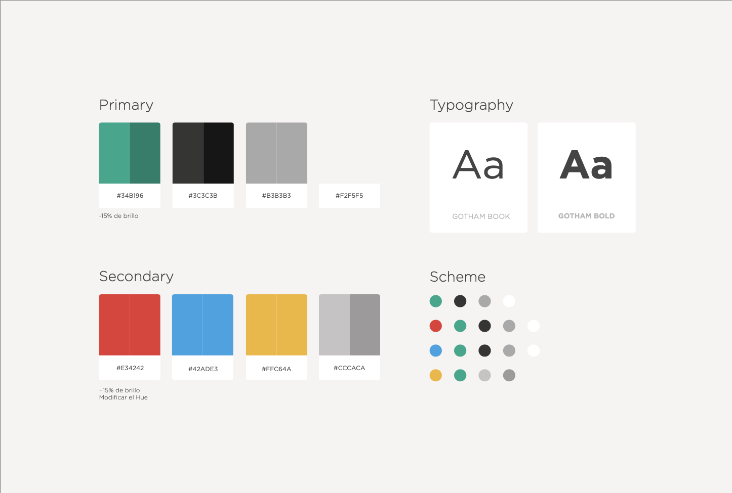
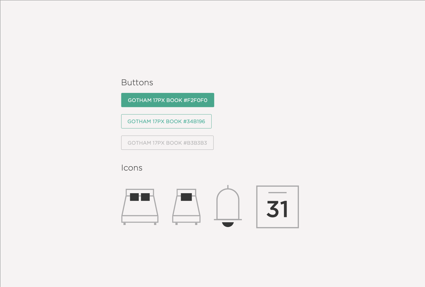
A design system built to scale
Colors, typography, buttons, and iconography were defined as a shared system rather than page-by-page styling, following Atomic Design principles so new screens could be assembled from existing parts instead of designed from zero. Responsive behavior and internationalization were built into that system from the start, not patched on later.
Reducing friction to the first search
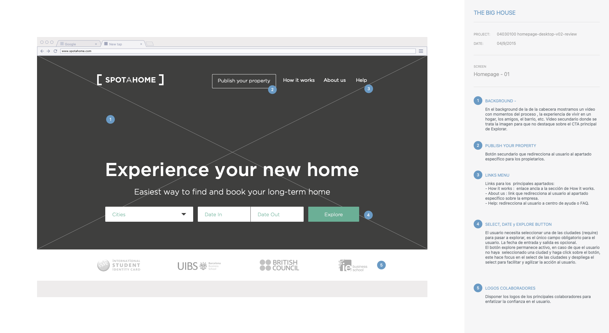
The homepage’s only required field was the city; check-in and check-out dates were optional. Partner logos sat below the search bar specifically to reinforce trust before a user searched, not after.
Making trust visible after booking
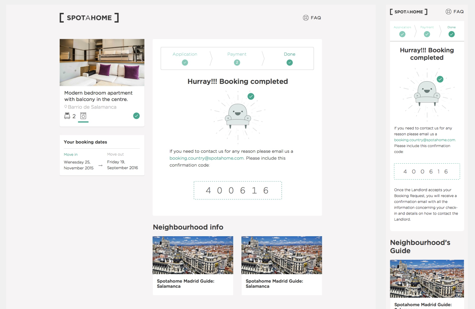
Runners and neighborhood insights, the differentiators named at the outset, showed up concretely at the point they mattered most: booking confirmation paired a neighborhood guide with the reservation itself, so a renter’s last impression before moving in was reassurance, not just a receipt.
Outcome
There’s no visibility into how the redesign performed once it shipped; no conversion or funnel data survived past handoff. What’s verifiable is what the design system enabled afterward: Spotahome expanded into new markets across Europe and Latin America, in multiple languages, without the design or the proposal it carried changing, and it supported new lines of business built around property owners rather than renters.